

Rotating banners, slideshows, carousels, whatever you want to call them, look great, add a cool bit of interactivity to your website and allow you to present more information in a compact space. And you should NEVER add one to your website.
No one is going to sit and watch a website’s carousel display slide after slide – you’re lucky if people pause long enough to view the first slide. When someone visits a website it’s typically because they have a specific purpose and they will not wait to see if the fifth slide in your slideshow contains the information they’re looking for.
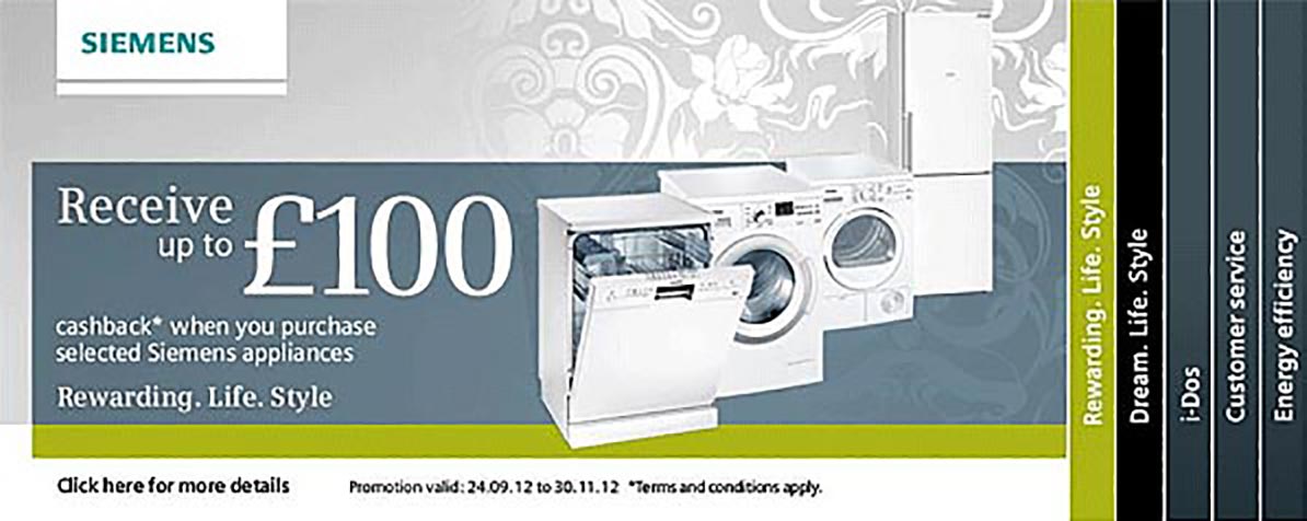
There are two well known studies that show just how ineffective sliders are. The first, from usability guru Jakob Nielsen asked visitors to review a website with a prominent banner image, asking visitors if Siemens had any special offers for washing machines on their site (pictured below). The website prominently displayed an offer in 98-point font that rewarded customers with £100 cash back on a new appliance, unfortunately most users didn’t see the offer because it was displayed inside of a moving slider and ended up being missed or ignored.
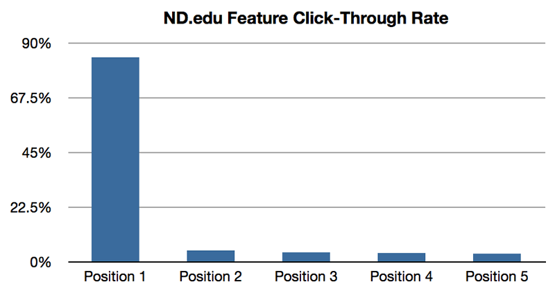
A second study at the University of Notre Dame found that only around 1% of visitors clicked on their website’s slider at all and 84% of the clicks were on the first item in the slider. That is a shockingly bad conversion rate, especially for the subsequent slides which are almost never viewed or clicked.
By using a slider you are increasing the complexity of your website, slowing down performance (forcing users to download extra images, CSS and HTML code) and creating a physical barrier to viewing important content.
We will almost always recommend having multiple banner sections spread out throughout the website instead of a rotating banner section. This highlights all of your important messages, distributes them throughout the page so there is a better chance of them being viewed and is massively better for mobile devices.
When it comes to building a website we follow these three rules to ensure you get the best conversion rates:
- We will never, ever add a slider just because other websites are using one, or a client has asked for one.
- We will always ask what is the best way to present your information – are there more efficient or effective ways to display this information.
- What is your website’s main goal? The header of your website, it’s most important real estate, should focus solely on this message. Secondary messages can be inserted farther down the page.