No matter how hard you work, or how much time you spend perfecting your website or marketing campaign, the proof is in the details. Even if you get almost everything right, it’s the little things that sometimes stand out most.
That’s why we focus on the little details in everything we do. The things that no one would never notice, but would be painfully obvious if they weren’t right. It’s one of our guiding principles – “good enough” is never an option.
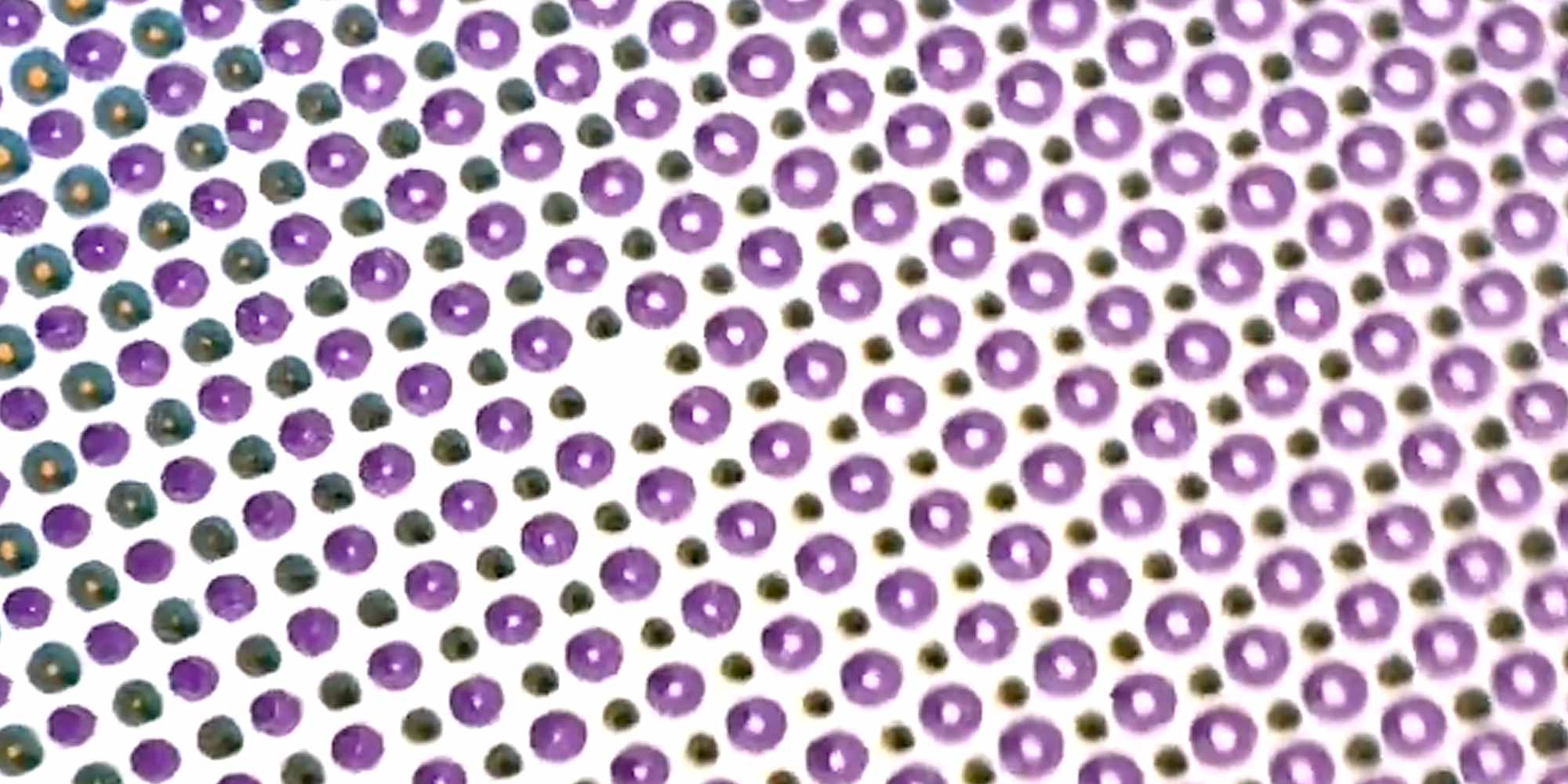
This post from Chilean artist Pablo Azocar illustrates this principle absolutely perfectly.
View this post on Instagram


